Showing posts with label Ivan Brunetti. Show all posts

Paris / Treen. Hwk 6, p.52.

I really don't expect anybody to be able to make any sense out of this strip except for the Mother it was intended for. She found it initially confusing... then when it had all sunk into place, hilarious and romantic; which was the reason it was made.  For anyone else it can be filed under 'in jokes'.  
This is still part of the Brunetti exercises that are ongoing.  For those still interested this is Hwk 6, p.52. The gist of the exercise is to do a story on relationships and include some form of variation in panel size. It was supposed to be black and white (which I have included below) but I couldn't resist n urge to try out some watercolours on it as well.  There is a second attempt below that was done before I had really thought about what i wanted the colour to achieve...rather than just colour the thing locally.
Really glad I took the time to have another go as the first one is a cold and lifeless piece in comparison.  
All feedback is gratefully appreciated.
Dan :)


A few CUs...


Original ink only version...

First watercolour attempt...

What the hell did Fairport Convention do to me?

Just finished this... ish. I'm gonna try out some colour eventually, and lose the photos of the album covers.  In the mean time I think I'll live with it in black and white as it seems to work ok.  Distribution black and white together with page layout is probably where I feel most comfortable and where my strengths lie.
The task was to write something about Summer, to include a 'sub-narrative' and to exploit a variety of panel sizes. Job done so far.
Whether it resonates with an audience will be interesting to see... although if you've had a wasted Summer wandering late at night along canal sides, dual-carriageways, rail embankments and visiting 24hr garages then is may strike a chord.
My pencils for this are below, thought it might be of interest as I'm always intrigued to see how other's go about their process. 
Comments always welcome. 
Dan.


Matt Forsythe and Harvey Pekar. Good / Bad


This post features all of the collected elements of an exercise in analysis, emulation and synthesis of varying comic attributes. It's from Ivan Brunetti's Cartooning book.

Firstly a direct copy of a Matt Forsythe page, then an essay that discusses my take on two comic pages from different comics.  Next up is a really interesting and very much recommended way to get to know another style of working. Then, the pages of the comics in question and ending with a dump of false starts and trials for good measure.

You can buy Matt Forsythe' magnificent comic here
...and you can read it online here  (but it's nice to have it in your hands.)

Feedback is always appreciated... 
Dan. 

My Comics Class copy


Matt Forsythe's Comics Class in the background, my prelim inked 
version in the fore and adding halftone in Photoshop.


Essay


Ok, so here is the really interesting/brain-bending task.  Take a panel from the 'bad' one and recreate it in the style of the 'good' one... and vice versa. I thought this was a surprising task. In order to be able to succeed you have got to look and think really closely about many  different things at once. How would the other artist reveal this, what would and wouldn't be shown? How can i get the  character to look both 'in the style of' another artist and like themselves?  What is the easiest way to recreate that slightly off halftone pattern? etc etc...

Here is the first and below that is a quick diagram...

and here is the next one.  The opposite way of approaching this. Similar diagram below.


Below are images of Mattew Forsythe's Comics Class - Cover and pages for exercise.
You can buy this magnificent comic here
...and you can read it online here  (but it's nice to have it in your hands.)


Extra stuff...


Below are two excerpts from American Splendour that collates two or Harvey Pekar's books. The examples are those that I used for the exercise.


A collection of process shots of the exercise. I've included it all, warts 'n' all.  I'm continually surprised by how it takes me a fait few minutes to be able to warm up... but I pretty much always start of bloody awful.  This has never been any different.  By the way, these are not in any order, just cut and pasted and slapped on.


Licking Piss off a Peashooter.


So, here is another exercise set from the Brunetti book that I have taken an incredibly long, laborious time ever.  I guess I try to fit in as many trials as I can into these single assignments, even though they are probably better attempted in a freer more 'dashed-off' style.  

What we have here is the second version (the first is below for comparison purposes) of the colour trial.  I really like the direction the later one is going.  I used some of those inkybrushes that are just sooo handy for quick work.  Mixed up some greys, a couple of pastels and a strong(ish) red and went at it like a bull in a china shop.  Some parts have worked and others haven't... but that's the only way I seem to get anything close to satisfying.  I guess practice will eventually allow me to produce the better parts on a more consistent level.

In between the two versions are a few of, what I consider  to be the better bits.

The one at the bottom was coloured in Photoshop and is just awful and flat.

Dan.


Anusol.

Hmmmm? how to introduce this? It's another exercise on my way through the Brunetti Cartooning book. This book will, from now on be referred to as BCB - i've repeated myself soooo many times.  Well, the task was to produce a 9 panel strip about an incident that occurred during that day.  Simple.
I like this strip on a few counts (lets be positive huh?) I like the colour, I like the punch line, I like some of the brushwork/drawing (panel 5 + 7), the treatment of light and the lit doc in the final panel.  This panel was posted to Mr Joe Decie for a bit of a crit - and I have to agree with him that the typw probably doesn't work that well, it\s quite tricky to read and a bit forced or mannered? .....aaaand maybe a panel or two is hard to decipher in the larger scheme. 
The wobly line in the later panels is supposed to be the past, like a wobbly screen in a sit com does.  
I'm guessing that most folks know what Anusol is.  For those who don't, It's supposed to treat Haemorrhoids, but is actually just causes embarrassment when it falls out of your schoolbag.

Dan. 

Brunetti homework assignment 3 p.38

Here are the 'finals' for the Brunetti ex on Kochalka.  Just six days worth of 4 panel excepts from life. Nothing flashy, just see what comes out.  Looking back on these I can see elements of a style emerging I guess... I'm still fanning around trying to figure out what to do with black...wavering between 'comiccy' simplified elements and objectively drawn bits (hands).  Quite like the type type.  Final 4 are my faves.
Dan.


Brunetti Homework assignment 3 (Roughs) p.38

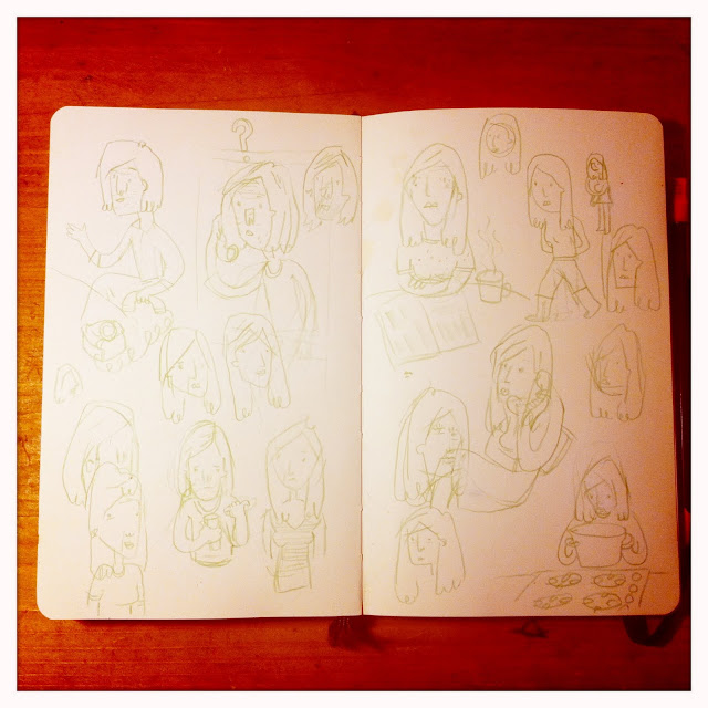
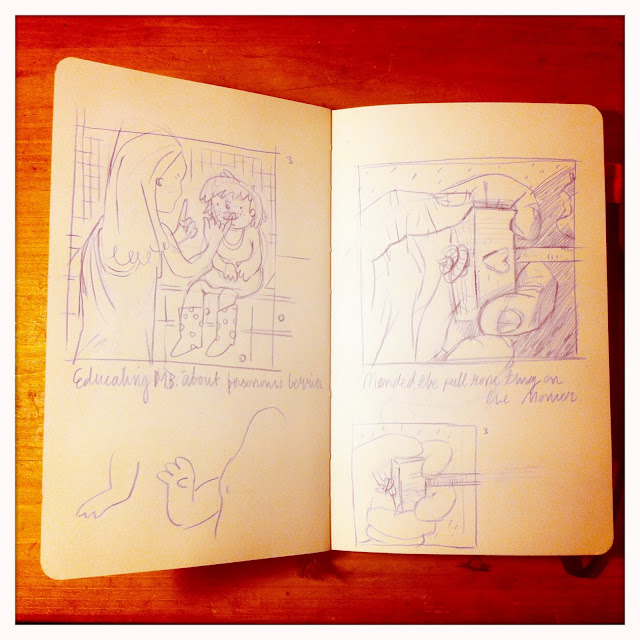
Here are the roughs for Brunetti's assignment 3.  I was working in an A5 Moleskine, mainly due to the problems and constraints that are provided by my lack of time (although I do still find time to watch a Borgen every night, so I can't complain too much.)  The A5 helps because I can draw in the car, in the doctors *relevant to story*, in the bath, on the loo, whilst giving a baby a bottle etc etc.  Trying to come up with a me, a girlfriend, a daughter etc was tricky.  I really do have these in real life, I've just never drawn them.
Any hoo, this task was based around Kochalka's daily strips. 4 Panels a day, no attempt to be meaningful or funny.  Really enjoyed doing it - a great way to keep a diary.  I can see why Kochalka does it - little things seem to magnify with only a short amount of time- but actually committing yourself... Inked strip to follow:)
Still can't believe I stapled my effin fingers together...